OTIS Global Site Redesign Proposal
2016
Description
OTIS global Site Redesign Proposal
Fields
Art Direction, Interaction Design, Web Design
-
OTIS Global is known for its world-class elevators. Yet, with its current site, the magnitude of their innovation and reach is hidden. By highlighting their elevators found in reknowned buildings such as the Eiffel Tower, we elevate and modern the brand to new heights.
-
-

-

 Logo animations highlighting different creative aspects of designer Alisa Alferova's portfolioArt Direction, Branding, Motion Graphics2014
 -

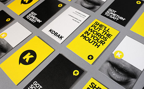 Bold branding and business cards for launch of Kobak Communications, a boutique PR firm.Branding, Graphic Design2014
 -

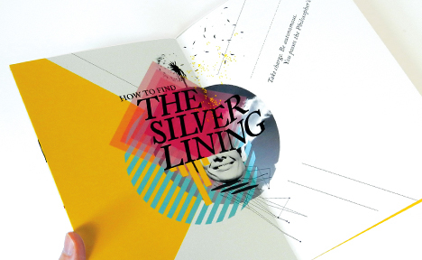 Ever wondered what makes you and everyone else happy? Here's the science behind it, wrapped up in a nice little box.
Also, the project strictly uses Adobe Caslon Pro, a workhorse typeface that like neuroscience may seem dry but presented the right way can be playful and fun.Art Direction, Graphic Design, Typography2014 -

 Rebrand for the Metropolitan Waterfront Alliance in an effort to raise awareness for the organization and bring about a renewed sense of community.Art Direction, Branding, Web Design2014
 -

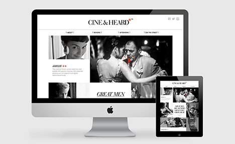 Rebrand of Films on Disk Inc. New name, name face, new web-based app for cinephiles.Branding, UI/UX, Web Design2014
 -

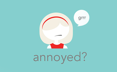 Polly is a web-based application for women. Talk to Polly, tell her your troubles and she'll try her best to make you feel better with images, video, infographics, a little sound advice.Branding, UI/UX, Web Design2014
 -

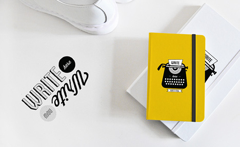 Products designed in collaboration with Barnes and Noble for their back to school collection. In stores this summer.Art Direction, Graphic Design, Product Design2014
 -

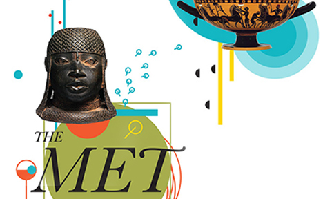 Fresh new series of products for the Metropolitan Museum of Art store.Art Direction, Graphic Design, Product Design2014
 -

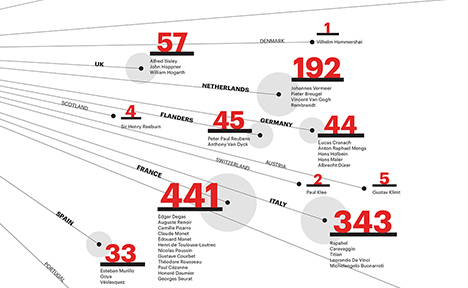 A new product series for the Metropolitan Museum of Art store.Art Direction, Graphic Design, Product Design2014
 -

 A motion piece designed to give the viewer a snapshot of music and design in the 60s'.Art Direction, Graphic Design, Motion Graphics2014
 -

 Analysis of the web-based app DAYTUM as parts of a whole.Graphic Design, Print Design2014
 -

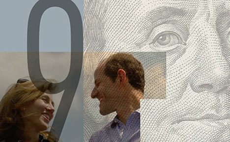 Title sequence for Client 9 documentary evoking intrigue and subtle incriminationArt Direction, Graphic Design, Motion Graphics2016
 -

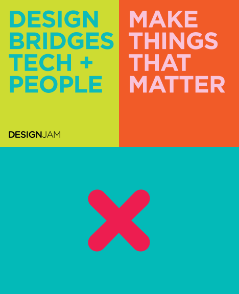 A prototype for a new design education model that brings lean startup principles to traditional design education.Branding, Entrepreneurship, Motion Graphics2016
 -

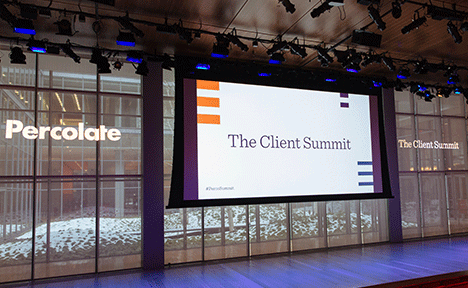 The opening sequence for Percolate's Client Summit.Art Direction, Branding, Motion Graphics2016
 -

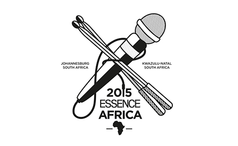 Logo designs for ESSENCE Africa FestivalArt Direction, Branding, Illustration2016
 -

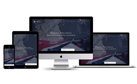 Sikorsky site redesign proposal, introducing a confident, human, proud, smart, innovative brandArt Direction, Branding, Web Design2016
 -

 A site redesign proposal for Gonzaga University in Spokane Washington inviting users to explore and unlock potentialArt Direction, Interaction Design, Web Design2016
 -

 Ship Your Side Project is a 6 week side project accelerator for mid-career tech and creative professionalsBranding, Entrepreneurship2016
All works © Amanda Phingbodhipakkiya 2013.
Please do not reproduce without the expressed written consent of Amanda Phingbodhipakkiya.
Please do not reproduce without the expressed written consent of Amanda Phingbodhipakkiya.
